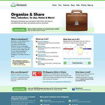
Backpack
Redesign of Backpackit.com by Jason Zimdars. Click the images below to see a full-size preview. Read on for insight into my design process.

Concept 1
My primary goal was to update the 37signals product look to be more crisp, friendly, and expressive. The stronger primary content area feels more inviting and enhances the brand and screenshot/video. The sign-up area is now more eye-catching and prominently features a large, compelling button.
Tweak and Re-use
Throughout the page I experimented with re-organizing, re-working, and re-displaying the content from the current home page.
Pointers
The left pointer tabs help organize the page, draw the eye to the section headings and visually recall both the add content tabs in the Backpack UI and the kind of bookmark tabs organized people tend to use in their documents.
But You Kept the Yellow?
The light yellow color used in 37signals’ products and websites is almost a trademark to me. I think it has to be there.
Concept 2
After turning the initial idea over in my head for a few days, I wanted to try a different direction. While the first idea might fit the model of an incremental design that would be familiar, yet refreshed, I really wanted to try a more original approach.
Simple and Focused
With this concept I wrote mostly new content starting from the top in a very conversational format. The message was stripped to include just the most compelling information in a format that can be absorbed quickly, compelling visitors to sign-up or continue moving through the site content.
Less Clutter
With less stuff to grab the visitor’s attention, this layout lets visitors focus onthe content without being distracted or overwhelmed. The overall feel is uncluttered, appealing and friendly—this goes hand-in-hand with the spirit of the app.
Only the Beginning
These are concepts without the benefit of your input. I hope they show an attractive aesthetic, attention to detail, and willingness to experiment. If this were the real project this effort would represent just two of many such directions.
I look forward to the opportunity to continue the project soon.
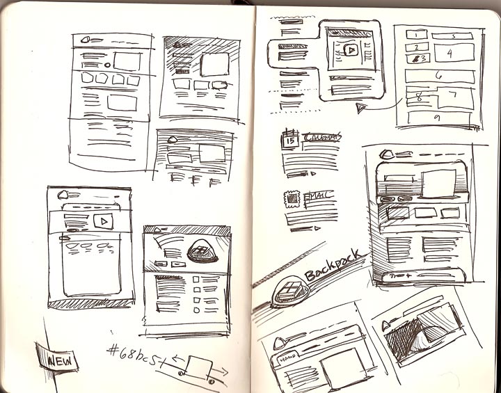
Design Process
I thought it might be interesting to see a glimpse of where my process took me and how I arrived at the above solution. Click the thumbnails to view larger images.
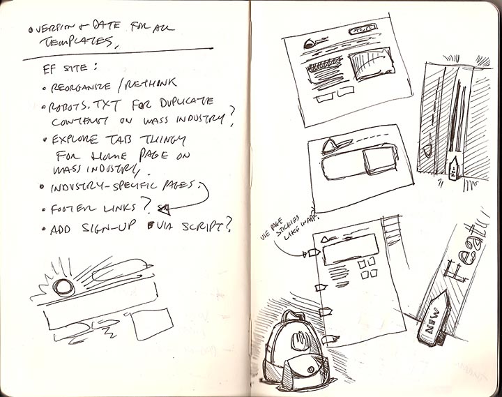
Sketchbook spread #1
Sketchbook spread #3

Sketchbook spread #2
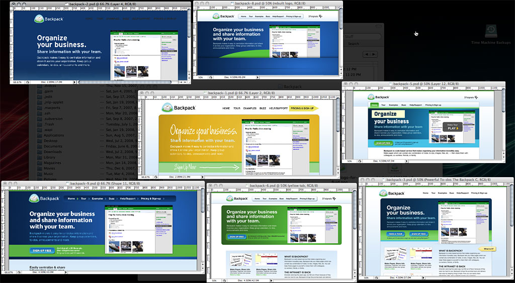
Photoshop Comps
 Let’s talk.
Jason Zimdars
twitter.com/jz
Resumé? Get it here.
I also have a blog and online portfolio that I never update. The cobbler’s kids are shoeless, you know?